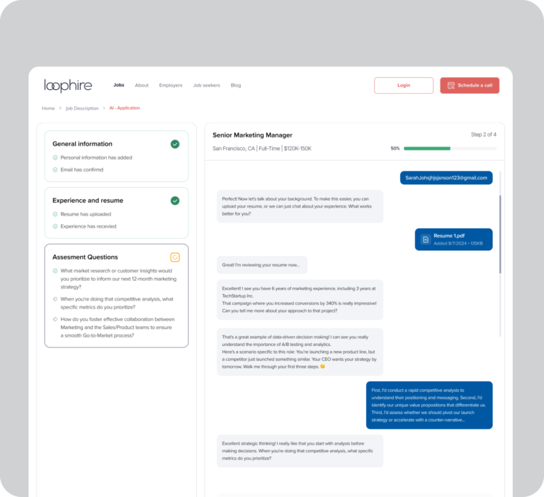
Loophire AI Job application
Currently in the final design and testing phase, Loophire is an AI-powered hiring product ...
UI UX Design
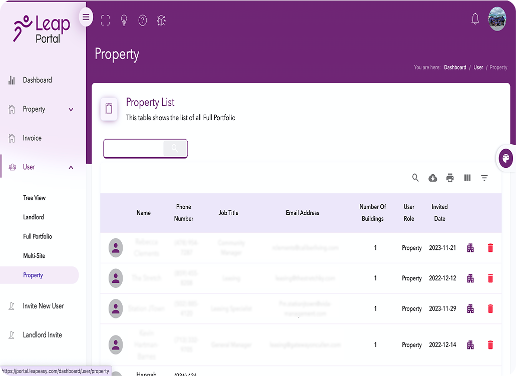
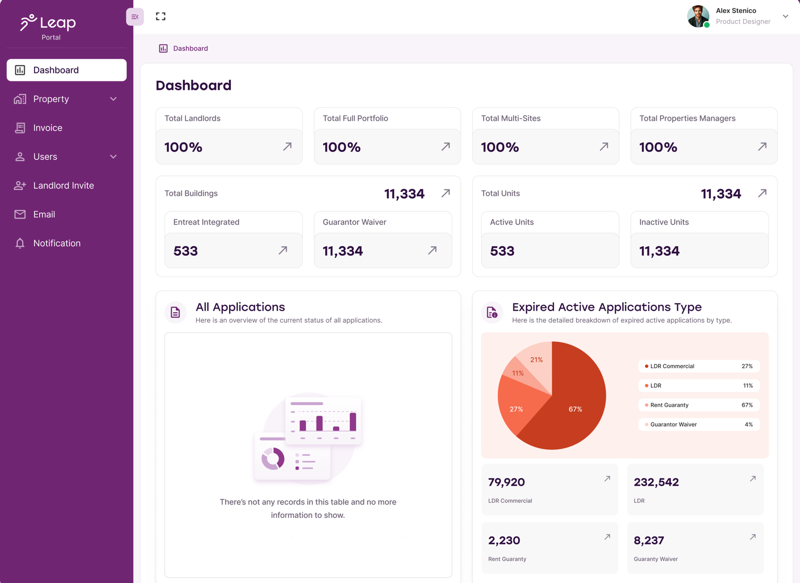
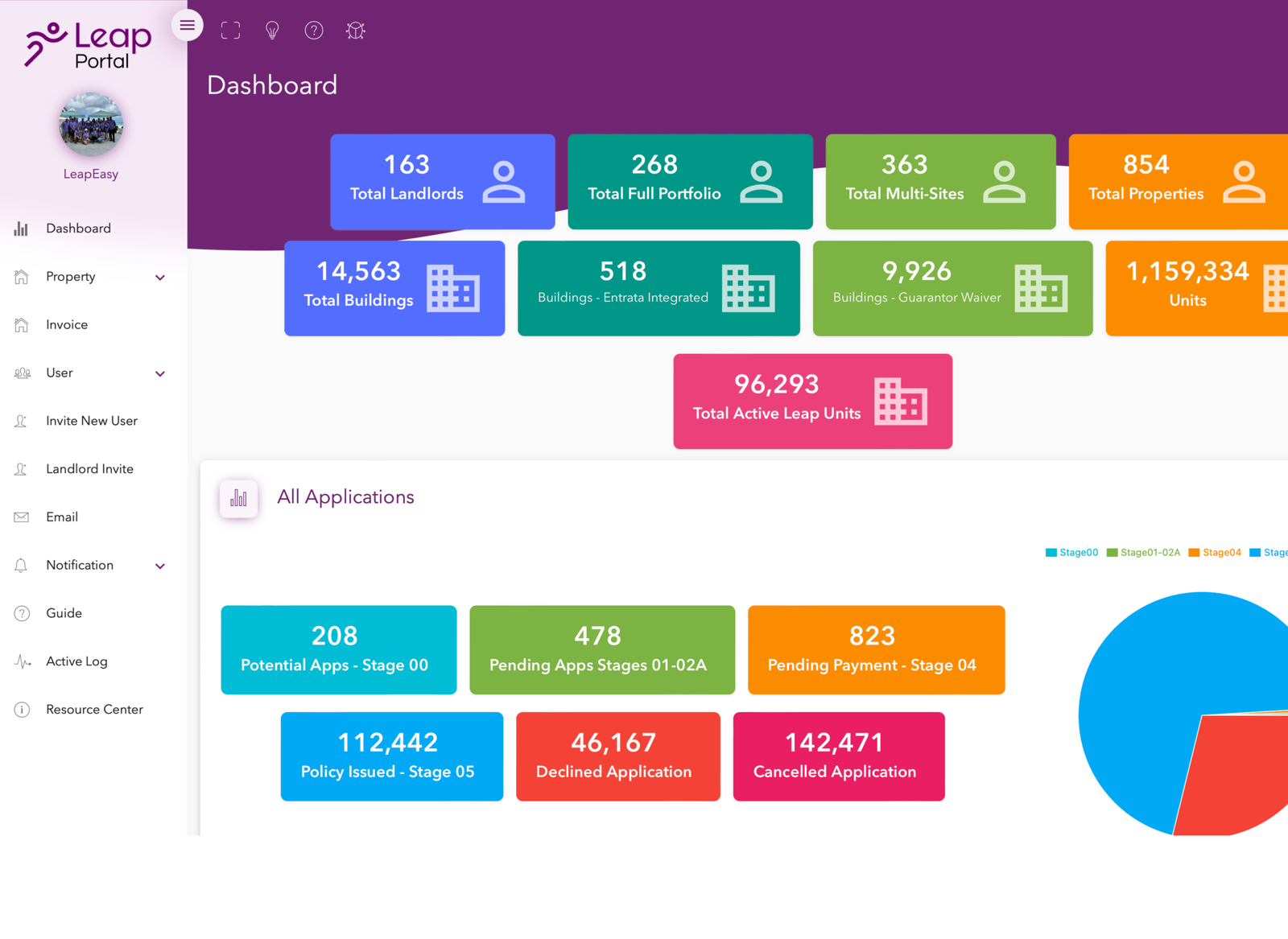
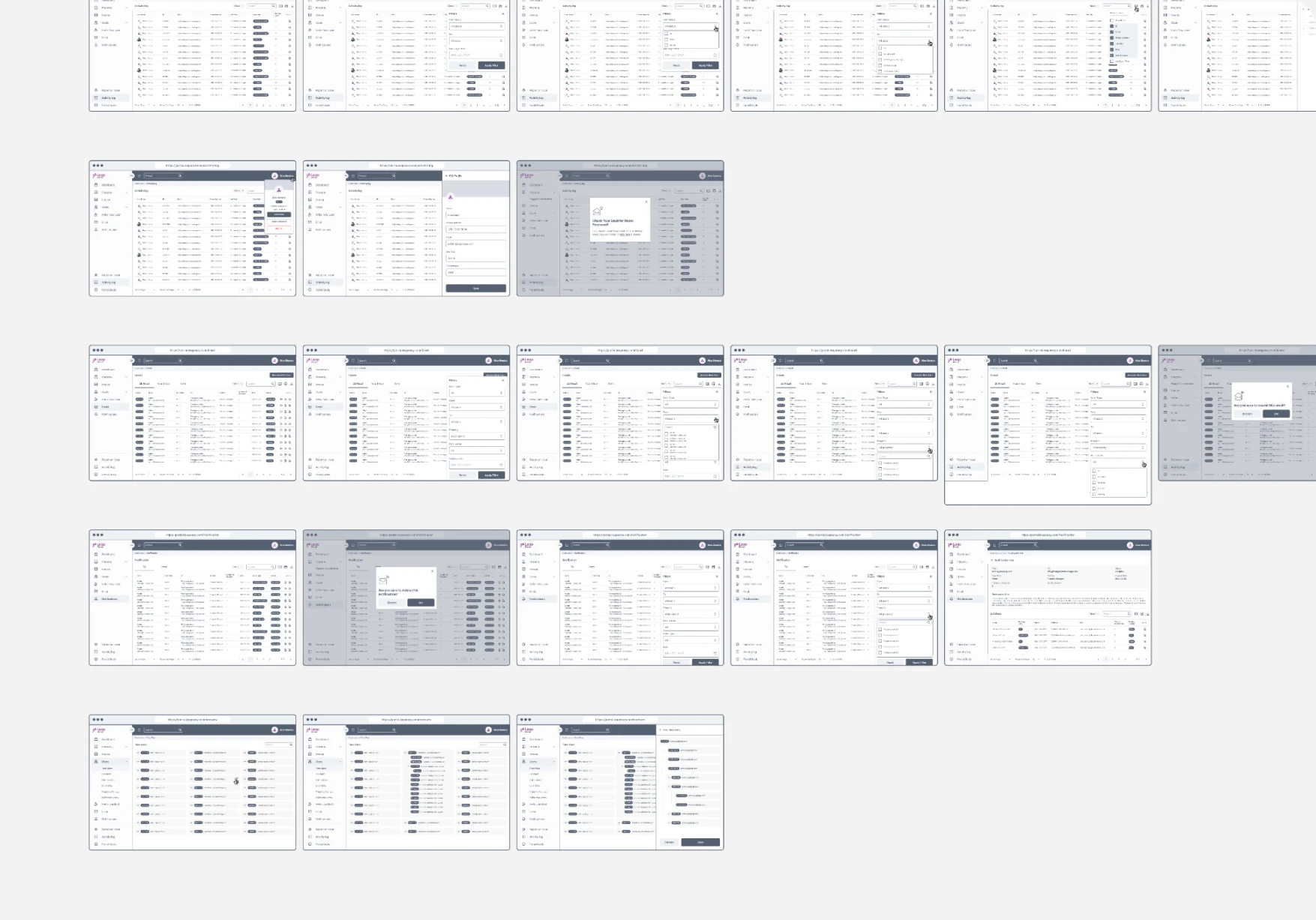
Redesigning the Leap user portal and building a scalable design system to create a clear, consistent experience aligned with both user needs and business objectives.
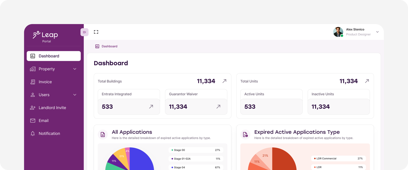
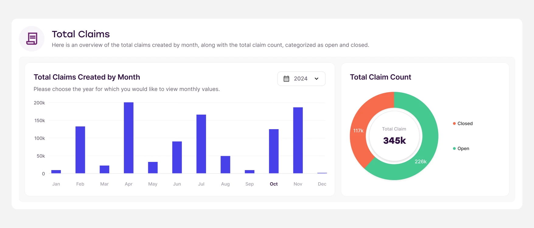
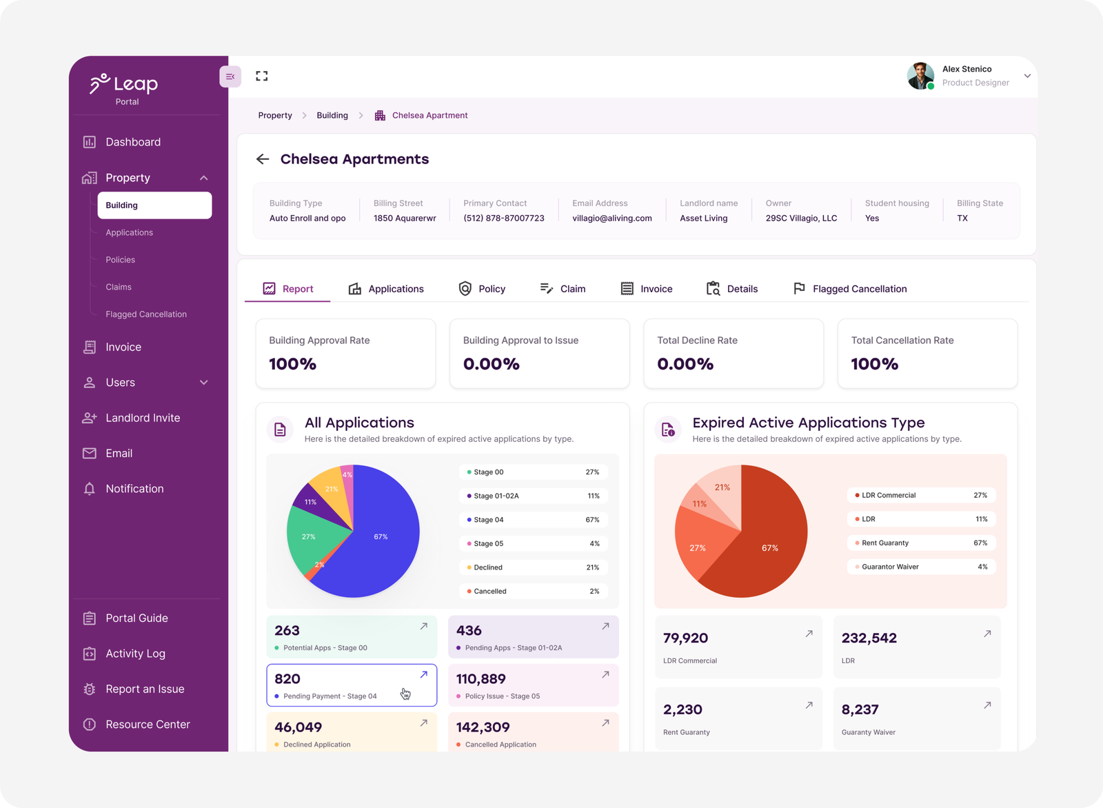
LeapEasy focuses on reducing cost and complexity in the rental process, helping both tenants and property owners make faster, more transparent decisions. The redesign of the product dashboard, along with the creation of a scalable design system, aligned business goals with user needs and resulted in a more predictable and efficient user experience.
Role :
Design Lead & Design System Manager
Duration :
~4 months
Country :
USA
Scope :
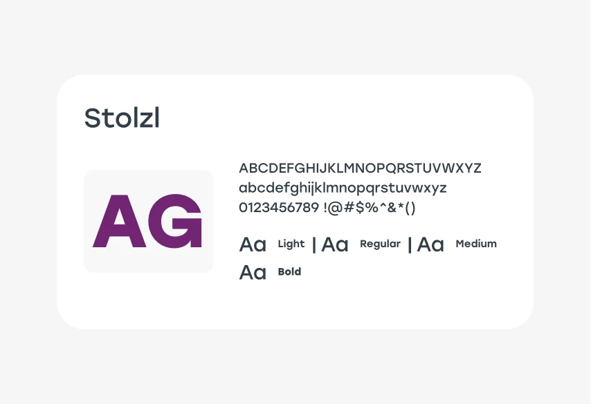
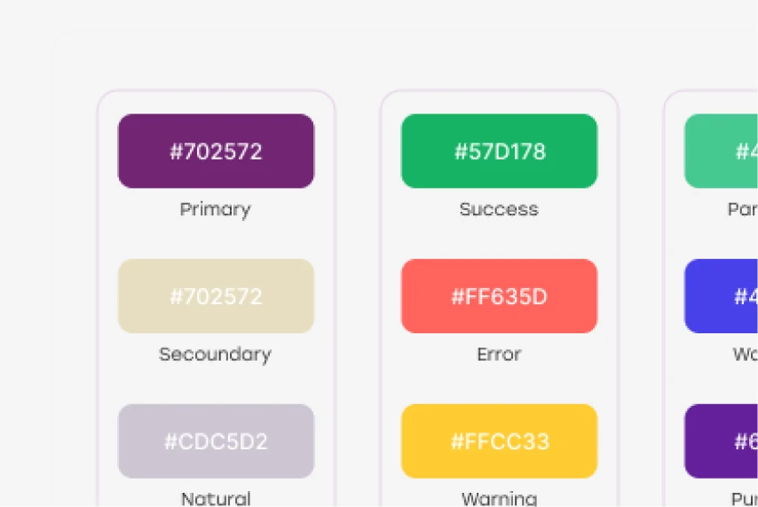
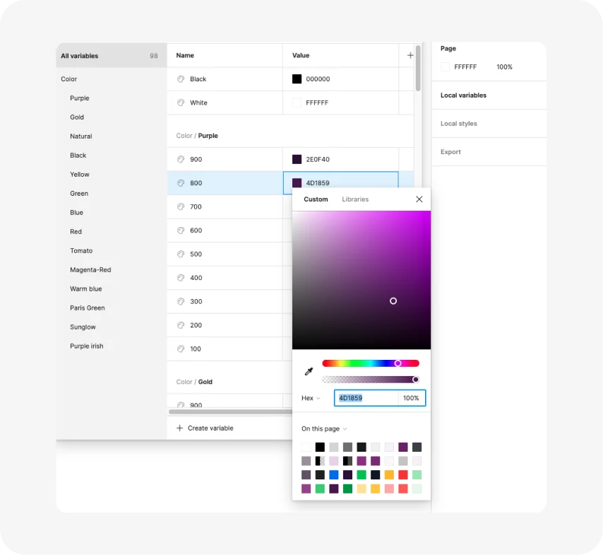
UX strategy, Design System , research, UI....
Industry :
Real Estate
Primary Tools :

Co-Founder & Chief Growth Officer at Leap
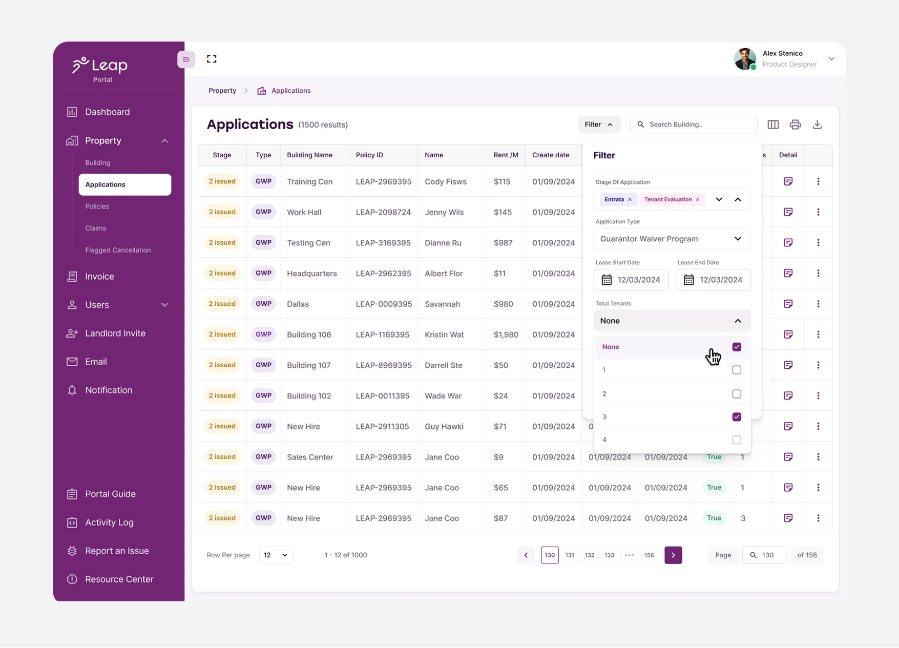
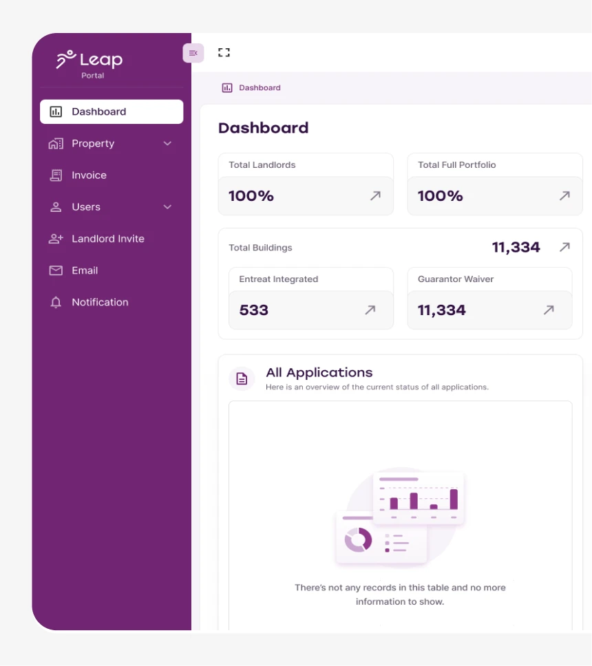
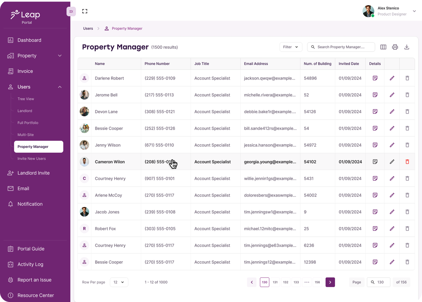
User experience suffered from poor visual hierarchy, making key info hard to notice overloaded UI, unclear priorities, scattered metrics, and too many decisions at once. Result? High cognitive load and slower task completion.
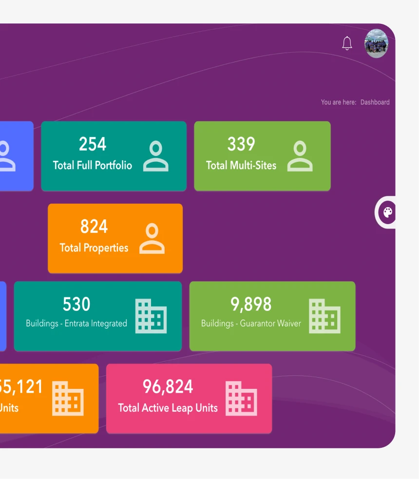
We rebuilt the experience with a smarter visual hierarchy, a re-architected navigation flow, and a task-focused dashboard. A cleaner modular layout now enables faster recognition, smoother decision-making, and a scalable .
significantly reduced the time required for users to complete key tasks.
created consistency across all screens, reducing confusion and improving overall product adoption.
created consistency across all screens, reducing confusion and improving overall product adoption.
helped users find what they need faster, lowering cognitive load and increasing confidence while navigating the portal.
provided a single source of truth for the product team, enabling faster design and development of new features
Optimized workflows that accelerate productivity and reduce friction:
34% faster task completion
28% fewer interaction steps
68% improved UI consistency
29% quicker handoff from design to development
Based on user testing and operational metrics